
I redesigned Mintpay’s responsive website to explain its payment model and create clearer journeys for customers and merchants. Working with the CEO, Product, and Frontend team, I combined a refreshed visual identity, simpler information architecture, and visual financial education in a one-month sprint.
Role
Senior Product Designer
Collaboration
Product Manager, Head of Marketing, CEO, two Backend Developers, and Frontend team
Timeline
One-month sprint
Platform
Mobile app, iOS and Android

Clear education and relevant audience journeys support app acquisition and merchant enquiries. A reusable system also supports future campaign delivery. Measured conversion or acquisition improvements should be supported by analytics before being attributed to the redesign.
Clearer customer education
Visual purchase scenarios explained how split payments worked, reducing the amount of financial interpretation required by the page.
A dedicated merchant journey
A separate B2B path communicated merchant benefits and the partnership proposition without competing with customer onboarding content.
A reusable web foundation
A modular component library supported consistency and provided a foundation for promotional landing pages.
An early-stage website no longer supported the product’s growth
Mintpay needed its website to explain an unfamiliar payment model while serving both consumers and retail merchants. The original experience combined dense copy, unclear navigation, and an MVP-level visual identity. Customers could struggle to understand how the offer differed from familiar interest-bearing instalment products. Merchants needed a clearer explanation of the business value of joining. The challenge was to make the proposition understandable and credible, while giving each audience a relevant next step.
I reviewed the website’s usability and analysed competitor approaches to fintech communication and brand identity.
The central insight was that the problem involved education as well as appearance. A more polished interface would still struggle if the payment model remained difficult to understand.
That shaped a “show, don’t tell” direction: demonstrate the payment structure visually, organise content around audience needs, and use a coherent identity to support credibility. The original does not document participant-based research methods.
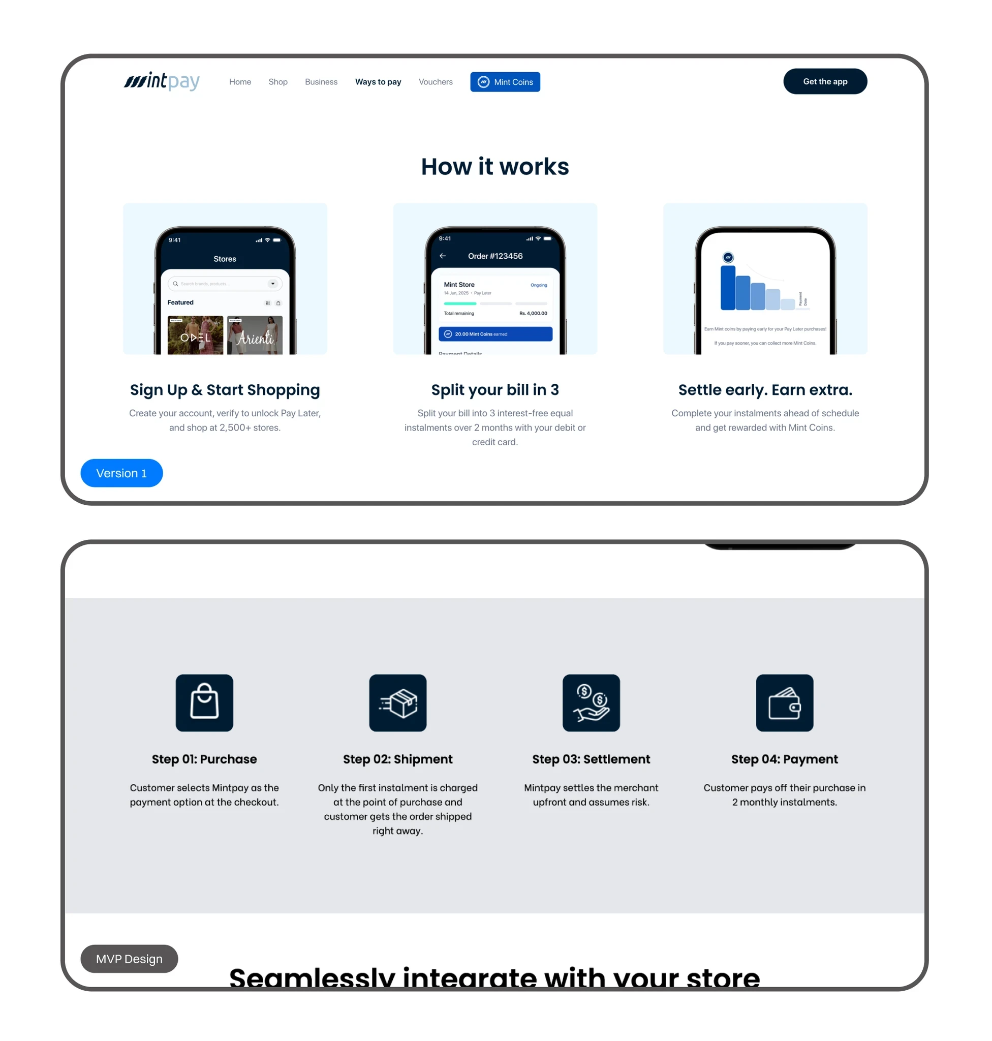
Separate customer and merchant journeys
I restructured the information architecture to distinguish the B2C and B2B paths. Customers could focus on how Mintpay worked and how to get started. Merchants could explore partner benefits and the commercial proposition. This gave each journey more relevant content and a clearer purpose.
Explain the payment model through purchase examples
I replaced jargon-heavy explanations with visual sample purchase scenarios. The design showed how a purchase was split, making the model easier to interpret without relying on dense text or mental calculation. The aim was to address uncertainty at the point where customers evaluated the offer.
Use competitor evidence to support a brand refresh
Marketing raised concerns about the effort required for a visual overhaul and the potential loss of early brand recognition. I used competitor analysis to show how fintech brands communicated maturity and credibility. This helped secure CEO and Marketing support for a Version 1 refresh, including lifestyle photography, a revised colour palette, and typography direction.

The delivered design brought together separate customer and merchant journeys, visual payment explanations, refreshed photography and brand styling, and a modular component library.
I worked with the CEO, Product Manager, Frontend team, and Marketing stakeholders to align the new direction and translate it into the responsive web experience.
The project ran as a one-month sprint. The original account presents the redesign as delivered but does not detail its release sequence.
The documented evidence includes competitor analysis and stakeholder alignment around the brand refresh.
The original reports acquisition, conversion, and engagement improvements but does not describe a usability-test sample, measurement window, or controlled comparison. These remain qualitative reported outcomes.
The following learning statements are proposed reflections for your review.
Education is part of the conversion journey
When customers are evaluating an unfamiliar financial product, understanding the offer is a necessary step towards choosing it. Visual examples should answer concrete questions about how payment works.
Different audiences need different explanations
Customers and merchants evaluate the same platform from different perspectives. Separating their journeys creates space for content relevant to each decision.
Brand direction can be grounded in product needs
Competitor analysis helped connect the visual refresh to credibility and communication, giving stakeholders a clearer reason to support the change.

Let's work together
Good products rarely need more complexity.
They usually need someone willing to understand the problem deeply enough to remove it.
If you’re building something ambitious and need a senior designer who can move between product thinking, interaction, craft and delivery, I’d love to talk.
Based in Melbourne, Australia
Full Australian working rights
Open to senior product design opportunities and selected contract work.

