Open to work

Open to work

Open to work

Based in Melbourne

Full Australian Working Rights

04:49:03 PM

Architecting Trust & Conversion

Architecting Trust & Conversion

Architecting Trust & Conversion

End-to-End Design for the Hom-Away Booking Platform

End-to-End Design for the Hom-Away Booking Platform

Role

Lead UI/UX Designer (End-to-End)

Timeline

4-Week Sprint

Platform

Responsive Web (Desktop & Mobile)

Audio Heading

Audio Description

Business Impact & Outcomes

Frictionless Conversion Funnel

Engineered a streamlined, intuitive search-to-book user journey designed to minimize drop-offs and maximize booking completion rates.

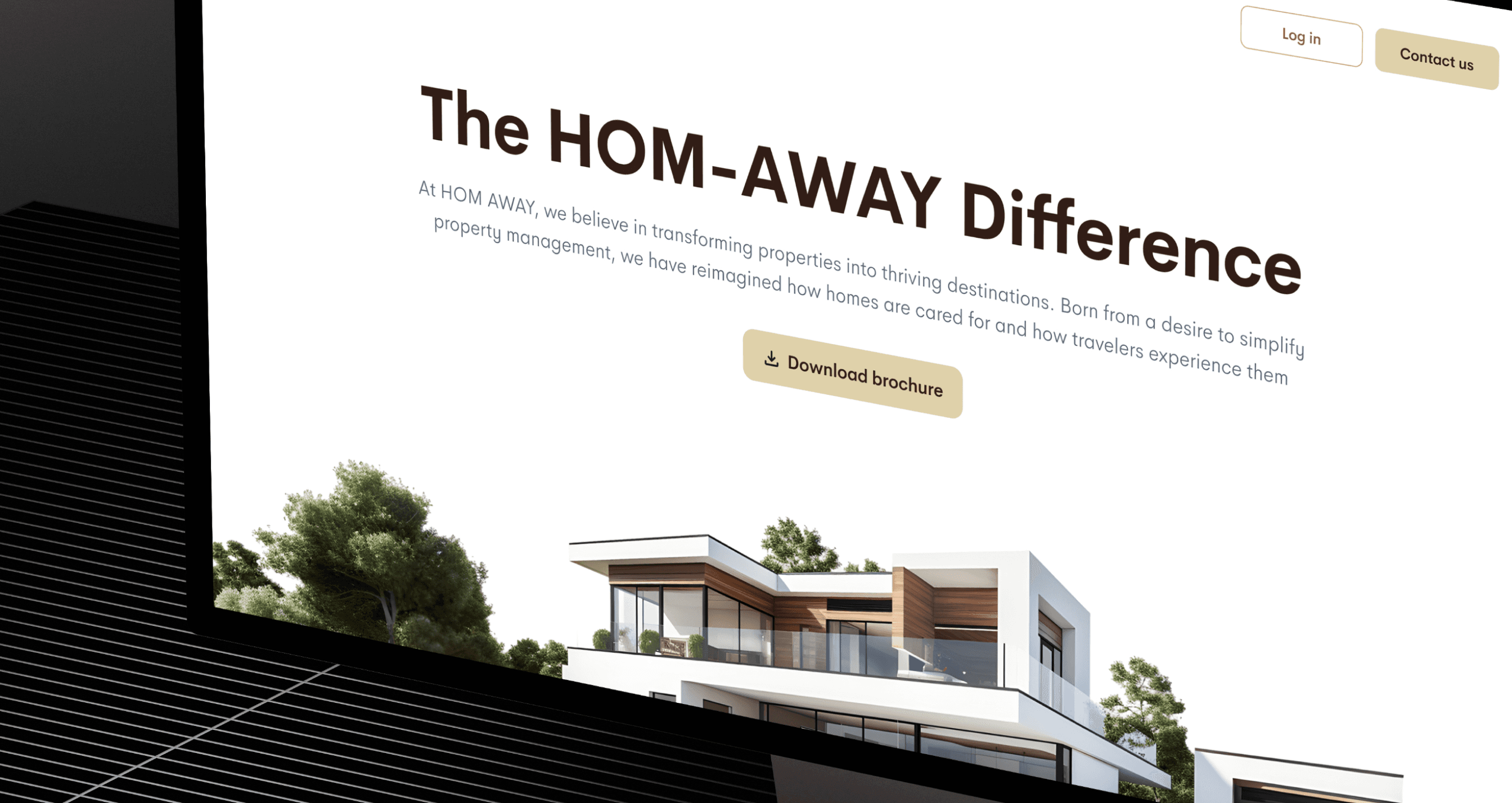
Established Market Credibility

Elevated the platform's visual identity from scratch, instituting a premium, trustworthy aesthetic necessary to compete in the highly saturated hospitality/booking market.

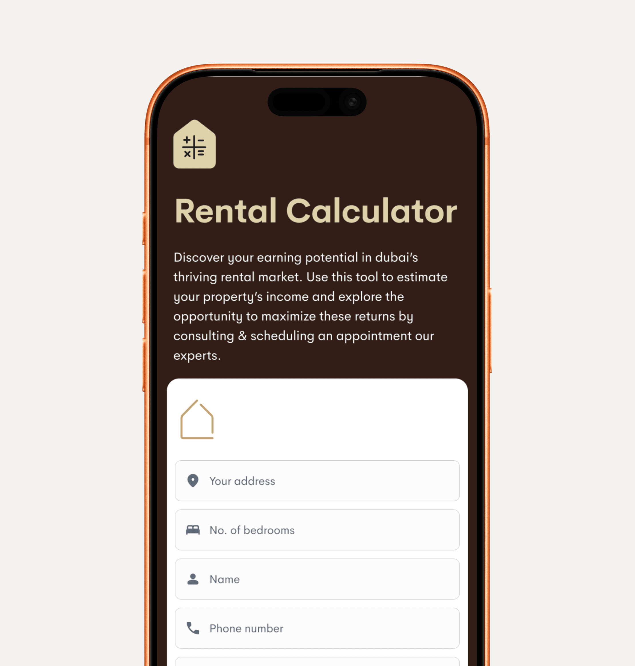
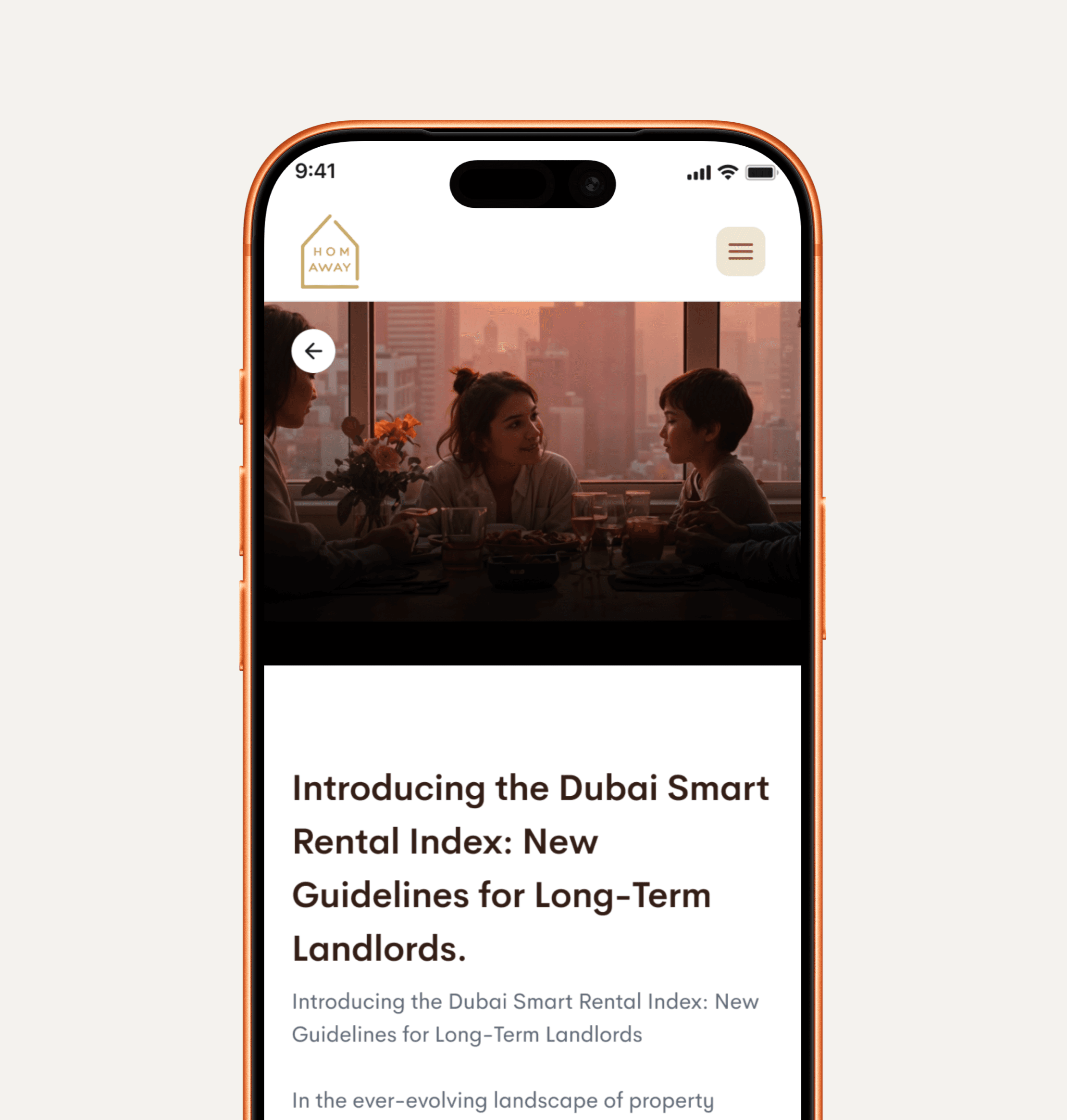
Optimized Mobile Experience

Delivered a mobile-first architecture that captures high-intent, on-the-go users without sacrificing the rich visual imagery required to sell properties.

The problem

Building a booking platform from the ground up requires navigating a heavily saturated market where user expectations are set by industry giants. For Hom-Away, the challenge wasn't just about making it look good; it was about building instant credibility.

Building a booking platform from the ground up requires navigating a heavily saturated market where user expectations are set by industry giants. For Hom-Away, the challenge wasn't just about making it look good; it was about building instant credibility.

The Trust Barrier

Users are highly hesitant to enter payment details or commit to a booking on a new platform if the UI feels disjointed, outdated, or lacks transparency.

Users are highly hesitant to enter payment details or commit to a booking on a new platform if the UI feels disjointed, outdated, or lacks transparency.

Search Fatigue

Booking platforms often overwhelm users with poorly structured filters, hidden fees, and confusing date-selection calendars, leading to decision paralysis and cart abandonment.

Booking platforms often overwhelm users with poorly structured filters, hidden fees, and confusing date-selection calendars, leading to decision paralysis and cart abandonment.

Information Overload

Property detail pages need to convey a massive amount of information (amenities, house rules, maps, reviews) without overwhelming the user or burying the "Book" button.

Property detail pages need to convey a massive amount of information (amenities, house rules, maps, reviews) without overwhelming the user or burying the "Book" button.

Strategic Discovery: The "Visual Decision" Principle

Through competitive heuristic evaluation, a core behavioral insight emerged: In hospitality, photos sell, but UX books. Users make snap judgments about a property within the first three seconds based on imagery, but they will instantly abandon the flow if the pricing breakdown is opaque or the calendar is glitchy.

Through competitive heuristic evaluation, a core behavioral insight emerged: In hospitality, photos sell, but UX books. Users make snap judgments about a property within the first three seconds based on imagery, but they will instantly abandon the flow if the pricing breakdown is opaque or the calendar is glitchy.

Core UX Principle Established

Transparent Progressive Disclosure. The design needed to lead with high-impact visuals and upfront pricing, saving dense text and secondary details for later in the scroll depth or behind clean modals.

Transparent Progressive Disclosure. The design needed to lead with high-impact visuals and upfront pricing, saving dense text and secondary details for later in the scroll depth or behind clean modals.

Navigating Product Trade-Offs

  • The Conflict: A common tension in booking platforms is the desire to surface as much property data as possible "above the fold" to answer all user questions immediately. However, doing so clutters the UI and distracts from the primary Call-to-Action (CTA).


  • The Resolution: I advocated for a strict visual hierarchy. I engineered the Property Detail Pages (PDP) to prioritize a massive, immersive image gallery and a sticky, high-contrast "Booking Card" containing only the price, dates, and CTA. Deep dive information like the full list of 30+ amenities or extensive cancellation policies was pushed into intuitively categorized, expandable accordions. This satisfied the need for information depth without sacrificing visual elegance.

The Solution & Execution

Robust Search & Filter Architecture

Designed a highly visible, frictionless search bar mechanism. I implemented an intuitive date-picker and a categorized filter system (e.g., price, guests, amenities) that allows users to narrow down their exact needs without reloading the page, significantly reducing search fatigue.

Conversion-Optimized Property Pages (PDP)

Conversion-Optimized Property Pages (PDP)

Built immersive property pages with "sticky" booking modules. This ensures that no matter how far the user scrolls down to read reviews or check amenities, the price and "Book Now" button remain firmly in their thumb zone, ready to capture intent.

Transparent & Secure Checkout Flow

Transparent & Secure Checkout Flow

Designed a multi-step, distraction-free checkout experience. To combat cart abandonment, I implemented clear, upfront cost breakdowns (separating base price, cleaning fees, and taxes) before the user reaches the final payment screen, eliminating negative surprises and reinforcing trust.