
Role
Product Designer (UI/UX)
Timeline
3-Month Sprint
Platform
POS Terminals, Tablets, and Mobile Payment Terminals
Team
CEO, Product Manager, Developer
Short on time?
Listen to the quick audio brief
Business Impact & Outcomes
Accelerated Checkout Speed
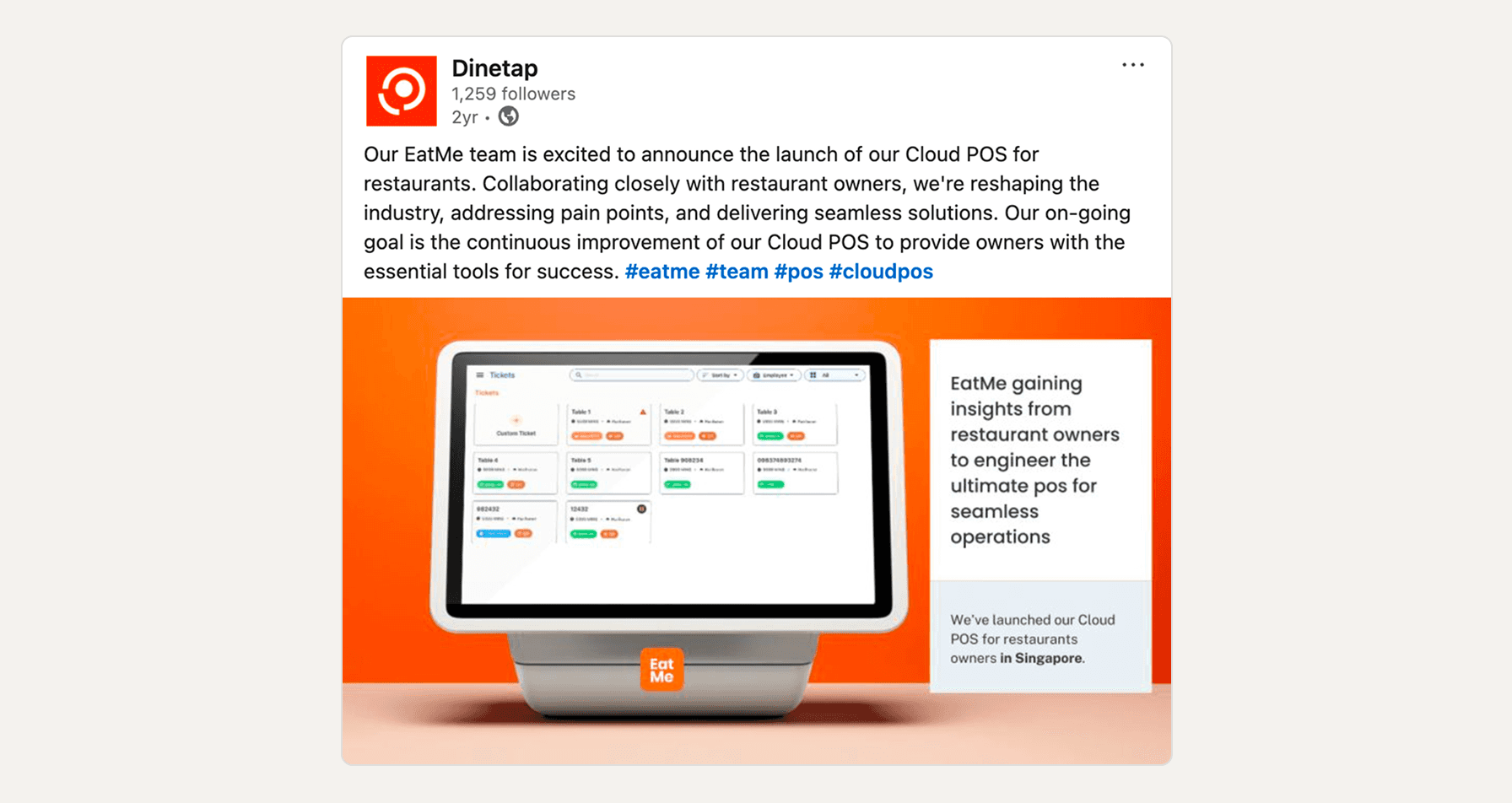
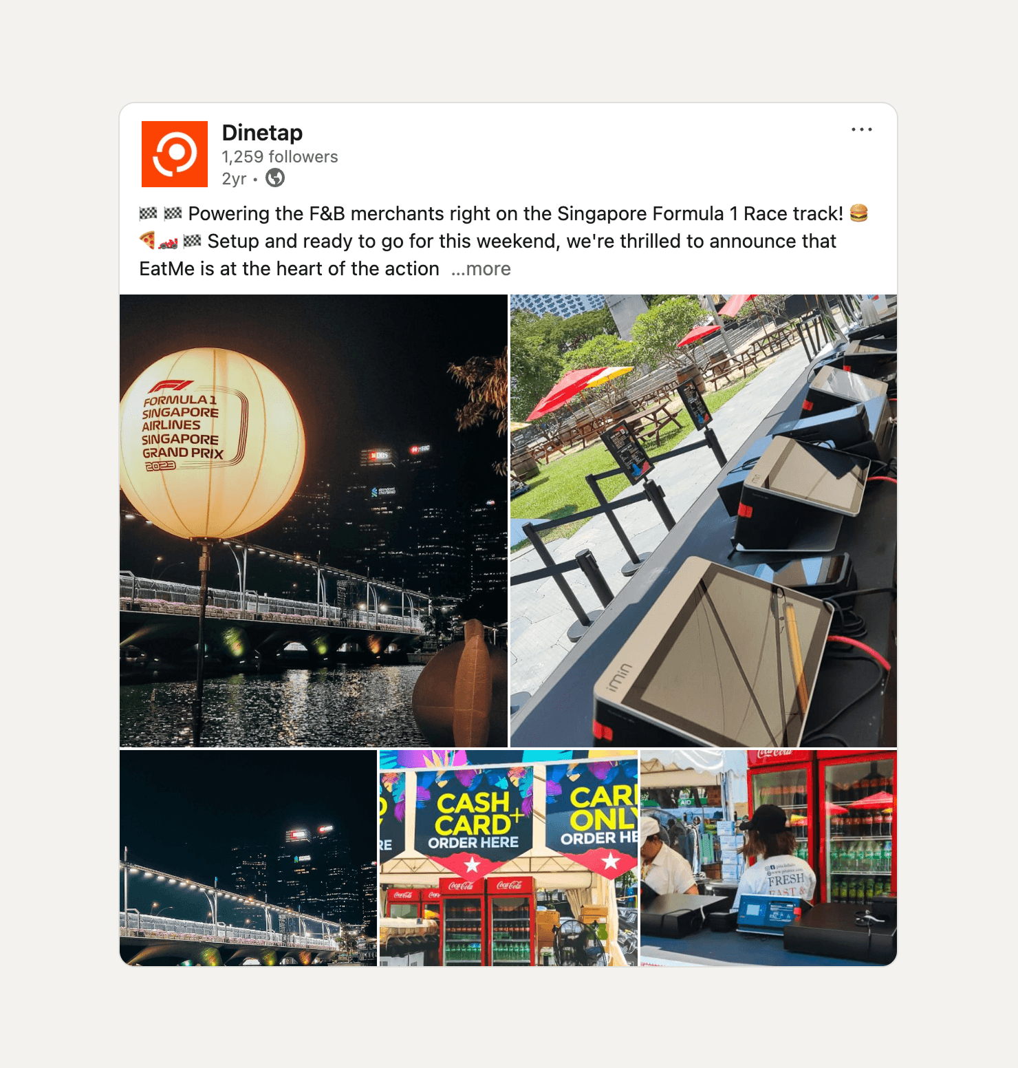
Drastically sped up transaction times during peak lunch hours and extreme high-volume events (proven at the 2023 Singapore F1 Grand Prix).
Slashed Training Time & Errors
Replaced complex legacy workflows with an intuitive interface, reducing staff onboarding from weeks to days while significantly decreasing costly order errors sent to the kitchen.
Drove Market Expansion
The polished, high-performance design acted as a key sales tool, directly helping the business secure major new restaurant accounts.
The Challenge
Legacy Complexity
Onboarding Friction
Edge-Case Failures

Strategic Discovery: Designing for the Rush
Glanceability under pressure
Navigating Product Trade-Offs
The Conflict: Stakeholders wanted an interface with "Apple-like simplicity," yet simultaneously requested that all menu items be visible on a single screen to "save taps." Furthermore, they wanted all possible payment methods crammed onto the checkout screen for QSR environments.
The Pushback: I advocated that visual clutter is the enemy of speed. Putting 50 items on one screen doesn't save time if the user has to spend 5 seconds hunting for the right button.
The Resolution: I successfully nudged stakeholders toward a smart categorization model. For our extreme high-volume "LITE" POS deployed for food stalls at the massive 2023 Singapore F1 Grand Prix, I took this a step further. I designed an aggressive information hierarchy that anchored fast-moving, high-frequency items at the top of the screen, dynamically pushing lower-priority items down. For the payment screen, I engineered a consolidated checkout view that accommodated all payment types without sacrificing touch-target size or speed.
The Solution & Execution
Robust Search & Filter Architecture
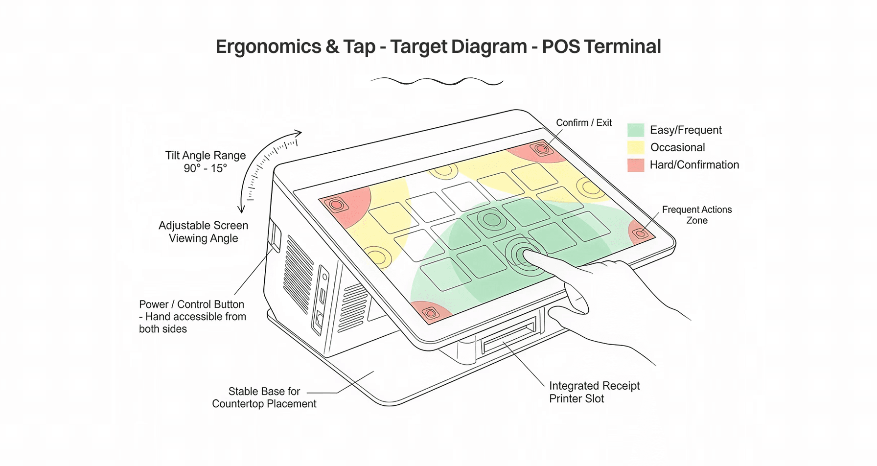
Replaced chaotic lists with a clean, fast-tap modular grid featuring oversized touch targets. This ensured staff could confidently input orders using muscle memory, minimizing mis-taps during high-stress rushes.
Engineered a frictionless flow for complex scenarios. Menu modifiers (e.g., "no onions, extra sauce") were elegantly nested to avoid cluttering the main screen, and the notorious "split bill" process was simplified into a visual, drag-and-drop-style interaction.
Implemented a strict, universally understood color-coding system to indicate order status (e.g., prep, ready, paid) and proper information hierarchy, allowing floor managers to assess the state of the restaurant with a single glance.